skip to main |
skip to sidebar
Introduction
Macd is one of the simplest and most reliable indicators available. Macd uses moving averages, which are lagging indicators but turn them into a momentum oscillator by subtracting the longer moving average from the shorter moving average. The subtracted value when plotted forms a line that oscillates above and below zero, without any upper or lower limits. Using shorter moving averages(5 & 10) will produce a quicker, more responsive indicator(fast macd), while using longer moving averages(12 & 26) will produce a slower indicator(Slow macd), less prone to whipsaws.
Macd measures the difference between two Exponential Moving Averages (EMAs). A positive Macd indicates that the 5 or 12-day EMA is trading above the 10 or 26-day EMA. A negative Macd indicates that the 5 or 12-day EMA is trading below the 10 or 26-day EMA. If Macd is negative and declining further, then the negative gap between the faster moving average (blue) and the slower moving average (pink) is expanding. Downward momentum is accelerating, indicating a bearish period of trading. Macd centerline crossoversoccur when the faster moving average crosses the slower moving average.

In Jan.2008, Macd turned down ahead of both moving averages, and formed a negative divergence ahead of the price peak(6274).
In Oct.2008, Macd began to strengthen and make higher Lows while both moving averages continued to make lower Lows(2259).
Finally, Macd formed a positive divergence in Mar.2009 while both moving averages recorded new Lows.
MACD Bullish Signals
1.Positive Divergence
2.Bullish Moving Average Crossover
3.Bullish Centerline Crossover
Positive Divergence
A Positive Divergence occurs when Macd begins to advance and the security is still in a downtrend and makes a lower reaction low. Macd can either form as a series of higher Lows or a second Low that is higher than the previous Low. Positive Divergences are probably the least common of the three signals, but are usually the most reliable, and lead to the biggest moves.
Bullish Moving Average Crossover
A Bullish Moving Average Crossover occurs when Macd moves above its 9-day EMA, or trigger line(red). Bullish Moving Average Crossovers are probably the most common signals. If not used in conjunction with other technical analysis tools, these crossovers can lead to some false signals.
Bullish Centerline Crossover
A Bullish Centerline Crossover occurs when MACD moves above the zero line and into positive territory. This is a clear indication that momentum has changed from negative to positive, or from bearish to bullish. After a Positive Divergence and Bullish moving average Crossover, the Bullish Centerline Crossover can act as a confirmation signal.
MACD Bearish Signals
MACD generates bearish signals from three main sources. These signals are mirror reflections of the bullish signals:
1.Negative Divergence
2.Bearish Moving Average Crossover
3.Bearish Centerline Crossover
Negative Divergence
A Negative Divergence forms when the security advances or moves sideways, and the Macd declines. The Negative Divergence in Macd can take the form of either a lower High or a straight decline. Negative Divergences are probably the least common of the three signals, but are usually the most reliable, and can warn of an impending peak.
Nifty showed a Negative Divergence when Macd formed a lower High in Jan.2008(& in Oct.09), and it formed a higher High at the same time. This was a rather blatant Negative Divergence, and signaled that momentum was slowing and Nifty fell strongly.
Bearish Moving Average Crossover
The most common signal, a Bearish Moving Average Crossover occurs when Macd declines below its 9-day EMA. As such, moving average crossovers should be confirmed with other signals to avoid some false readings.
Bearish Centerline Crossover
A Bearish Centerline Crossover occurs when Macd moves below zero and into negative territory. This is a clear indication that momentum has changed from positive to negative, or from bullish to bearish. The centerline crossover can act as an independent signal, or confirm a prior signal such as a moving average crossover or negative divergence. Once Macd crosses into negative territory, momentum, at least for the short term, has turned bearish.
The significance of the centerline crossover will depend on the previous movements of Macd as well. If Macd is positive for many weeks, begins to trend down, and then crosses into negative territory, it would be bearish. However, if Macd has been negative for a few months, breaks above zero, and then back below, it might be a correction. In order to judge the significance of a centerline crossover, traditional technical analysis can be applied to see if there has been a change in trend, higher High or lower Low.
MACD Benefits
One of the primary benefits of Macd is that it incorporates aspects of both momentum and trend in one indicator. As a trend-following indicator, it will not be wrong for very long. The use of moving averages ensures that the indicator will eventually follow the movements of the underlying security. By using Exponential Moving Averages (EMAs), as opposed to Simple Moving Averages (SMAs), some of the lag has been taken out.
As a momentum indicator, Macd has the ability to foreshadow moves in the underlying security. Macd divergences can be key factors in predicting a trend change. A Negative Divergence signals that bullish momentum is waning, and there could be a potential change in trend from bullish to bearish. This can serve as an alert for traders to take some profits in long positions, or for aggressive traders to consider initiating a short position.
Since Macd's introduction, there have been hundreds of new indicators introduced to technical analysis. While many indicators have come and gone, the Macd has stood the test of time. Theconcept behind its use is straightforward, and its construction is simple, yet it remains one of the most reliable indicators around. The effectiveness of the Macd will vary for different securities and markets. The lengths of the moving averages can be adapted for a better fit to a particular security or market. As with all indicators , Macd is not infallible and should be used in conjunction with other technical analysis tools.
MACD Drawbacks
One of the beneficial aspects of the Macd is also one of its drawbacks. Moving averages, be they simple, exponential or weighted, are lagging indicators. Even though Macd represents the difference between two moving averages, there can still be some lag in the indicator itself. This is more likely to be the case with weekly charts than daily charts. One solution to this problem is the use of the Macd-Histogram.
READ more on Macd @ Stockcharts.com
Combining EW with Macd:(Read the related post)
Since the last post on Oct.09, you can see the price declining sharply after a "5 wave structure" and a negative divergence in Macd.

For Investors: Investors who have a huge portfolio can use the weekly macd chart to spot the Negative divergences to "Part Book" once and during the Bearish Cross over a second "Part booking" and a last one at Bearish centreline crossover. Similarly Start buying in parts when Positive divergences start to develop and add more to it with Bullish cross over & Bullish centreline crossover.
For Traders: Use it in combination with other Technical tools such as Stochastics and with a basic EW knowledge to make entry & exits. When you combine your studies of various time frames such as Week, Day & Hour, you have potentially a system which will follow the prices to a good accuracy.
Needless to emphasise here, there are no foolproof systems in stock markets but only more efficient ones in relative term. Yourexperience, your discriminating ability to stay off the market when the picture is muddy & unclear with choppy moves, your patience to wait for good set ups/ opportunities, your intuitive risk taking ability when the euphoria & Fear are at their peaks will set you on a path to riches.
Technical analysis is a study of past prices of an index/ Stock or Commodity with the assistance of certain mathematically derived tools to forecast the future price movements. However, the simplest & most effective tool devoid of mathematical applications which identifies and confirms a trend is called a trendline (Channels) .
Stocks move up on persistent demand(buying) or down because of relentless supply (selling) or sideways because of a close tussle between buyers & sellers. A trendline in most occasions says it all. If you observe lane discipline and travel by the sign boards, you reach your destination safe & sound. Trendlines help you reap the richest haul from the markets in a similar safe way.
A trend line is a straight line that connects two or more price points and then extends into the future to act as a line of support or resistance. The upward sloping trendline may be called a demand lineas stocks bounce of that line due to a rise in demand and similarly the downward sloping trendline may be called a supply line as every time the stocks reaches that line supply comes in & prices fall. In a sideways market, the unresolved "supply & demand" gets into a tussle for supremacy which gets resolved when either demand or supply overpowers the other. As long as the larger trendline is intact, each sideways move will get resolved in favour of the main trend.
Uptrend Line(Demand line)
An uptrend line has a positive slope and is formed by connecting two or more low points. The second low must be higher than the first for the line to have a positive slope. Uptrend lines act as support and indicate that net-demand (demand less supply) is increasing even as the price rises. As long as prices remain above the trend line, the uptrend is considered solid and intact. A break below the uptrend line indicates that net-demand has weakened and a change in trend could be imminent.
Downtrend Line (Supply Line)
A downtrend line has a negative slope and is formed by connecting two or more high points. The second high must be lower than the first for the line to have a negative slope. Downtrend lines act as resistance, and indicate that net-supply (supply less demand) is increasing even as the price declines. As long as prices remain below the downtrend line, the downtrend is solid and intact. A break above the downtrend line indicates that net-supply is decreasing and that a change of trend could be imminent.
Semi-log Chart for Higher cycles(Week/Month)
High points and low points appear to line up better for trend lines when prices are displayed using a semi-log scale. This is especially true when long-term trend lines are being drawn or when there is alarge change in price. Most charting programs allow users to set the scale as arithmetic or semi-log. A semi-log scale displays incrementalvalues in percentage terms as they move up the y-axis. A move from Rs10 to Rs20 is a 100% gain, and would appear to be a much larger than a move from Rs100 to Rs110, which is only a 10% gain. The rate of ascent appears smoother on the semi-log scale. On the semi-log scale, the trend line fits all the way up.The semi-log scale reflects the percentage gain evenly, and the uptrend line was never broken till jan.08. Long term investors will do well to use this semi-log charts to maximise their gains by increasing their holding period. Smart investors will exit at the channel peak when the sentiment reading is of "Euphoria" with highest PE.

Arithmetic Chart for lower cycles(Day/Hour)
An arithmetic scale displays incremental values (5,10,15,20,25,30) evenly as they move up the y-axis. A Rs10 movement in price will look the same from Rs10 to Rs20 or from Rs100 to Rs110. On the arithmetic scale, three different trend lines were required to keep pace with the advance.

It takes two or more points to draw a trend line. The more pointsused to draw the trend line, the more validity attached to the support or resistance level represented by the trend line. The general rule in technical analysis is that it takes two points to draw a trend line and the third point confirms the validity.

The magic of trendlines unfold into channels when parallel lines are drawn and these channels give you often the "targets" to book out as well as "fresh entry point" as illustrated in the chart of "UNITECH".
As the steepness of a trend line increases, the validity of the support or resistance level decreases. The angle of a trend line created from such sharp moves is unlikely to offer a meaningful support or resistance level.
Combining timecycles:
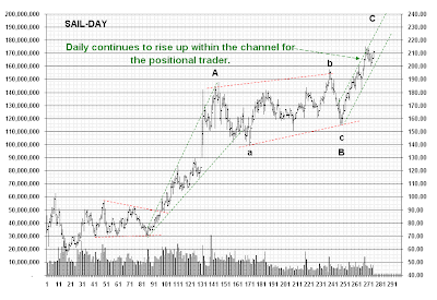
As illustrated from the chart of "SAIL"- Daily & Hourly, a trendline breakdown in the lower time cycle(Hour) may be construed as a merecorrection as long as the higher timecycle prices are trending up within the channel. When the price breaks down in the hour which also coincides with the likely breakdown in the daily, a critical reversal point is spotted early on and a trade could be initiated with a high potential profit with limited risk.

In EW study, trendlines play a very important role in identifying a wave(as Elliott never defined what is a wave?), the end of corrections, type of corrections, target setting coupled with fibonacci relationships and most important of all is the early warning signal of the end of the 4th wave with a small(false) break down in the trendline, thereby initiating the swift 5th wave trade which then completes the trend.
Trend lines can offer great insight to trading coupled with horizontalsupport and resistance levels or peak-and-trough analysis.

Trendlines are easy to apply and the trader need to be persistent as well as consistent and balanced in his approach. Highly traded stocks has highly tradeable channels. As trendlines follow only the prices, not the often distracting technical oscillators, many traders swear by it and base their trading strategies with only trendlines.
The simplest of all technical analysis, Trendlines, which effectively captures the demand & supply - the very basic of stock price behaviour, if exploited in a balanced way with tremendous amount of patience & conviction, can bring the riches beyond a trader's/ investor's imagination..Believe in it.
Get Rich Slowly.
The direction of the stock/index price movement is called aTREND. Prices either be rising or falling or moving narrowly(flat)."Trend is your friend"-the often repeated phrase carries its weight in gold. Pay heed to this phrase all the time to become an unbeaten market player.
The most basic Trend analysis:
Uptrend: Prices are rising and making higher tops and higher bottoms.
Downtrend: Prices are making lower bottoms and lower tops.
Sideways or Flat trend: Prices are moving in a narrow range with choppiness.
The terms bull market and bear market describe upward and downward market trends, respectively.

Prices do not rise or fall in a straight line but gets interrupted with counter moves in the opposite direction. These counter moves can be of zigzag or flat or some kind of triangles giving rise to minor tops & bottoms against the main trend.
For eg: If the trend is up, prices after a significant upmove will pause and make minor lower bottoms & lower tops- called corrections/ counter trend rally. Once this correction is over, the main trend will assert itself by taking the prices to new highs.
A top: is nothing but a price level from which the stock reverses direction to move downwards.
A bottom: is that level from where the scrip reverses the downmove and starts to rise.
A TREND: is the position of these tops and bottoms that determines the trend at any given point of time.
At any given point of time an investor or a trader has three options - to buy, sell or stay away from the market. If the trend is rising, he would do well to buy. If the trend is falling, he should be selling, and if the trend is flat, it is best to stay away unless you are capable of handling micro movements. Most of a trader's losses arise from trading in a flat market . Patience plays a vital part when market moves in a sideways, choppy mode.
Trend following for Medium to Long term Investing:

This weekly chart shows the benefit of trend following for the maximum gains requiring highest amount of discipline and patience.
A falling market cannot keep falling and at one point of time it is vulnerable to change. This change in the direction of the trend is called a trend reversal. Once reversed, the new trend will make higher tops & higher bottoms until exhaustion sets in and it starts to make lower top and lower bottom.
Technical Analysis is this process, whereby one can spot trend reversal at an early stage and can ride the trend till the weight of evidence proves that it has reversed directions.
Trend following for short term Trading(Hour):
Short term traders will do well to follow closely these minor price tops & bottoms and plan their trades. Many traders mix up the time cycle while following the trend and end up holding a losing position. For eg: One goes long spotting a trend change in the hourly time frame but hold on to it in spite of a continuation of the downtrend in the daily time scale. Every trading position has an "Expiry date" to it. If the anticipated price does not unfold within a set of time frame, exit thereby protecting the capital.

Trend following for short term Trading(Day):
This simple concept of observing tops and bottoms posted by the stock can help the investor/ trader in riding the trend and spotting trend reversal.The short term trader must keep the daily trend as the main factor but use the hourly trend for entry & exit.

I label all the critical pivot points in numbers(tops & bottoms) which help me tremendously to follow the market as numbers stay on in my mind longer and number is what I see on the trading screen.
Price: One of the first rules of trend following is that price is the main concern. Traders may use other indicators showing where price may go next or what it should be but as a general rule these should be disregarded. A trader need only be worried about what the market is doing, not what the market might do. The current price and only the price tells you what the market is doing.
Money Management: Another decisive factor of trend following is not the timing of the trade or the indicator, but rather the decision of how much to trade over the course of the trend.
Risk Control: Cut losses is the rule. This means that during periods of higher market volatility, the trading size is reduced. During losing periods, positions are reduced and trade size is cut back. The main objective is to preserve capital until more positive price trends reappear.
Though this concept appears very simple, it is probably the most important concept that can be quite profitably employed in trading the market. In using this concept, one may use either a bar/candle chart or the close price chart. Find the time cycle that best suits your time and nature and follow that trend to find your treasure.
Get rich slowly.


